Case study: Opulent bathroom with ornate detailing
The owners of this luxury flat in Maidenhead dreamed of creating an opulent space which offered the perfect place to escape after a busy day.
With the homeowners looking to create a luxurious retreat, Designer Alfie from Ripples Beaconsfield set about sourcing the finest fixtures and fittings to transform a dark unwelcoming room into a sumptuous space.
The layout
The existing bathroom was contemporary in style but featured dark tiled walls and black sanitaryware, giving the impression that the room was much smaller than it was. The ultra-modern style was not in-keeping with the period of the property or the style the homeowners had created in the rest of their home so they were keen to completely re-imagine each element.
The size of the room meant we were quite restricted in what we could do with the layout, especially as the homeowners wanted to incorporate both a bath and a decent-sized shower. Also key within the space was the bespoke ballerina artwork which the clients commissioned especially for the room, so I needed to make sure the art was a key focal point within the design. With this in mind, we placed the artwork opposite the door, to draw your eye to it when you first enter the room. This was positioned directly above the other stand-out element of this design, the freestanding bath. The bath was an original piece which we were able to re-polish and re-enamel to give it a new lease of life and a striking reflective silver finish.
“My clients wanted to create a one of a kind, totally bespoke feel for their bathroom so it would make a real statement.”
-Alfie, Designer
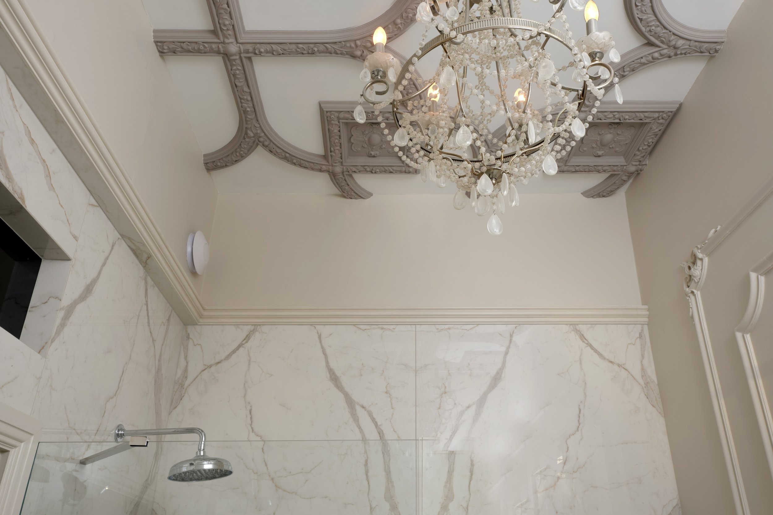
The left-hand side of the room was the perfect space to create the large walk-in shower from the client’s wishlist. To create a luxuriant feel, we book-matched 2 large-format marble tiles to create a show-stopping backdrop, then the area was finished with a shower niche, perfect for storing shampoo & shower gel.
Fixtures & fittings
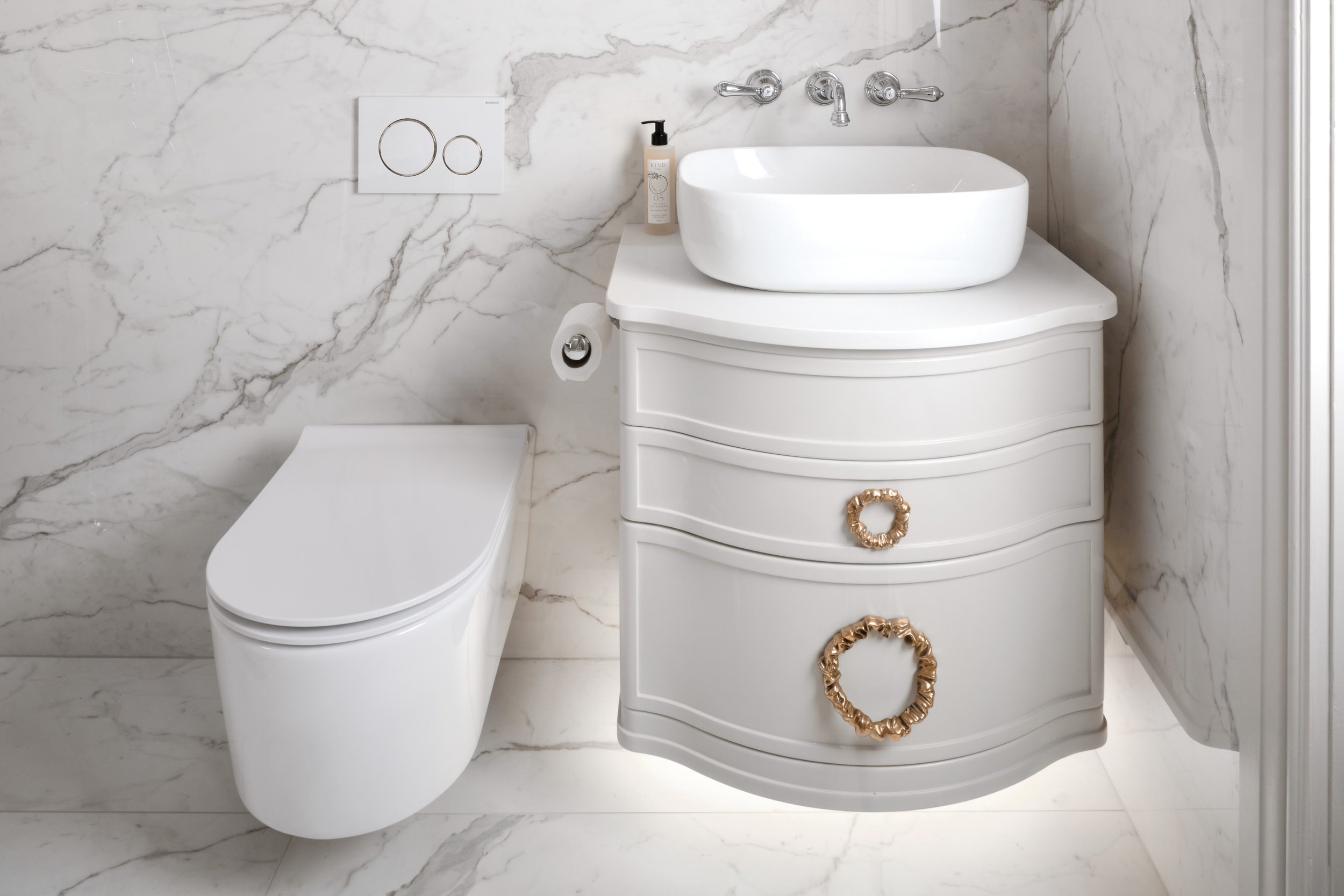
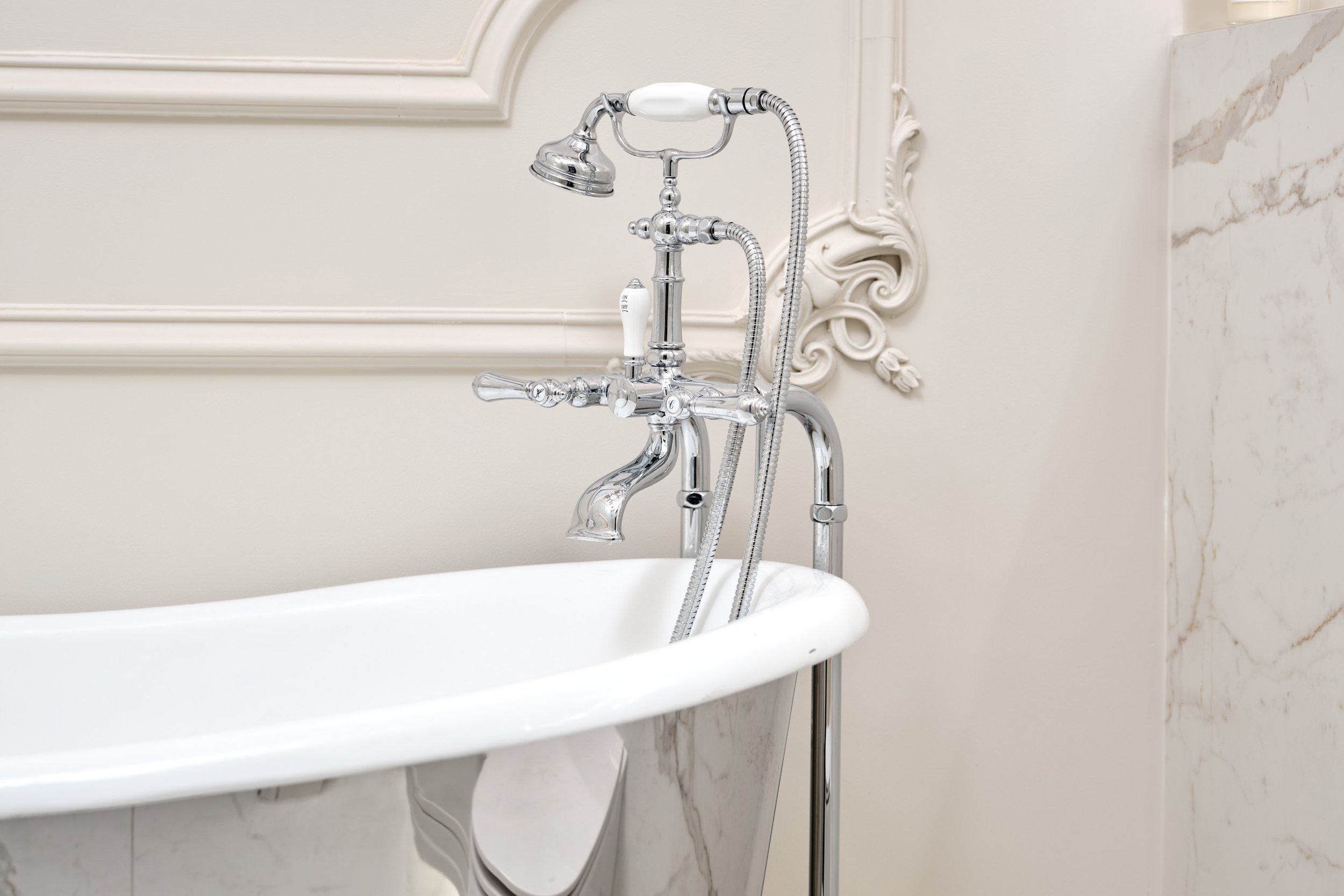
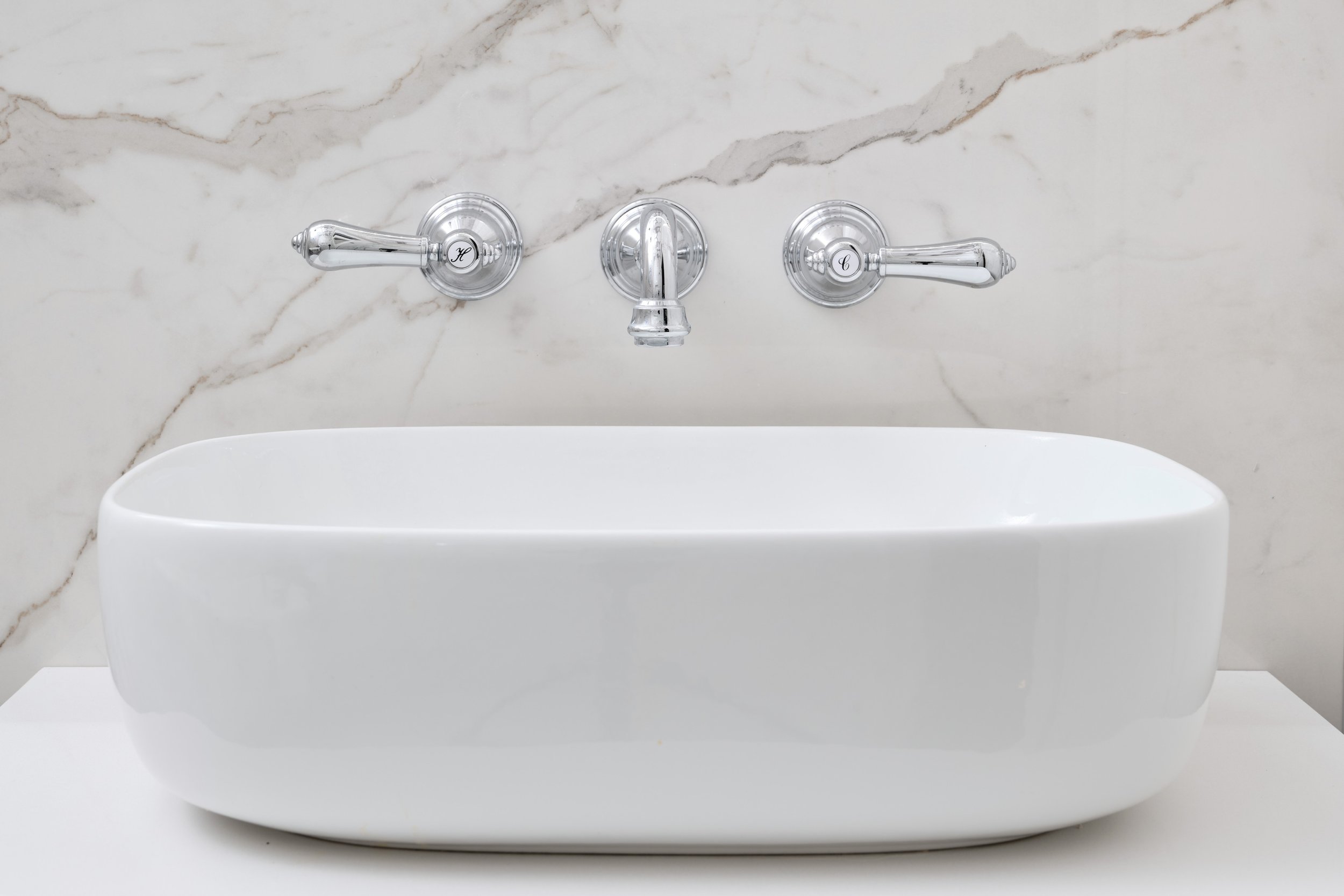
To maintain the feeling of opulence, the homeowner chose beautifully elegant brassware which really captures the traditional Edwardian aesthetic of the property. Each piece of brassware is finished in chrome to perfectly match the silver sheen of the bath. We opted to keep the rest of the sanitaryware quite simple in style, to make sure we didn’t overwhelm the space and to allow the more elaborate elements to take centre stage.
To elevate the space further, we added ornate moulding to the walls and ceiling as another nod to the history of the property and an opportunity to enhance the feeling of luxury created in the room. The vanity unit was chosen for its interesting traditional shape and was supplied unfinished to allow us to paint it in a bespoke colour to match the walls. The handles were supplied by the homeowners themselves, having spotted them on their travels, and tie together the gold elements featured in the tiles.
Tile choice
A number of tiles were used in this space to create interest in different areas of the room. The large-format shower tiles were 2780mm x 1200mm and were only 6mm thick meaning they were extremely fragile to transport and install but they give a highly dramatic effect. Elsewhere, light neutral tiles were used to accentuate the double height ceiling and the gloss tiles help bounce light around the room, especially in areas where LED’s have been installed. The matt floor tiles were an excellent choice as not only are they in-keeping with the marble wall tiles but they have anti-slip properties which is especially important in a room with a walk-in shower.
The details
Location: Maidenhead
Designer: Alfie, Ripples Beaconsfield
Price: From £20k (not including installation)
Products: Freestanding bath, marble large-format tiles, wall-hung WC, floor-standing bath mixer
Love the gold and silver look? Take a look at a recent client project featuring gorgeous gold brassware and silver tiles.
For advice, tips and tricks from our team of specialist bathroom designers, download or request a copy of our free Style Guide.


