Case study: Pretty pastel bathroom with miniature slipper bath
Famed for her love of bright bold hues and graphic prints, interiors blogger Geraldine (@littlebigbell) wanted her new bathroom to match the aesthetic of the rest of her happy home.
With a modest sized space to work with, Gerladine was keen to find space-saving solutions which wouldn’t comprise on colour, character and most importantly, fun. She worked with Jo, Senior Designer at Ripples London to help bring her vibrant vision to life.
Scoping out the space
To kick off the design process, Jo visited Gerladine’s home in North London, to not only scope out the existing bathroom but to soak up every inch of what makes Geraldine’s home so special. Followers of Gerladine’s @littlebigbell Instagram account will be familiar with her instantly recognisable pastel palette, playful pops of colour and love of pattern but her existing bathroom hadn’t been touched in over a decade and was an uncharacteristically beige space in need of an upgrade. After the home visit, Geraldine and Jo reconvened at the Ripples London showroom to get the creative juices flowing.
“Once I had a solid understanding of the aesthetic Geraldine wanted to achieve, I selected a few products for her to take a look at in the showroom. It was a fun, collaborative session which sparked lots of interesting ideas for incorporating plenty of colour, pattern and texture.”
- Jo, Senior Designer
Creating the layout
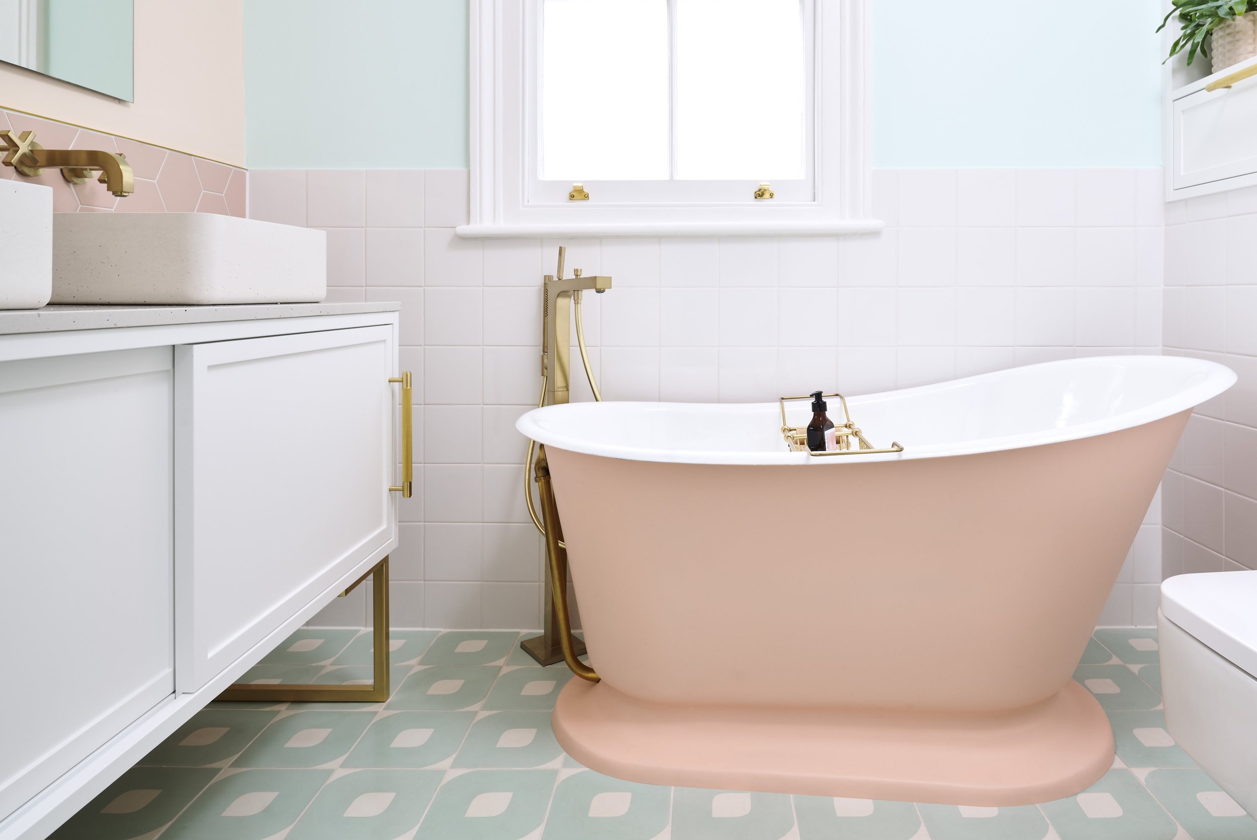
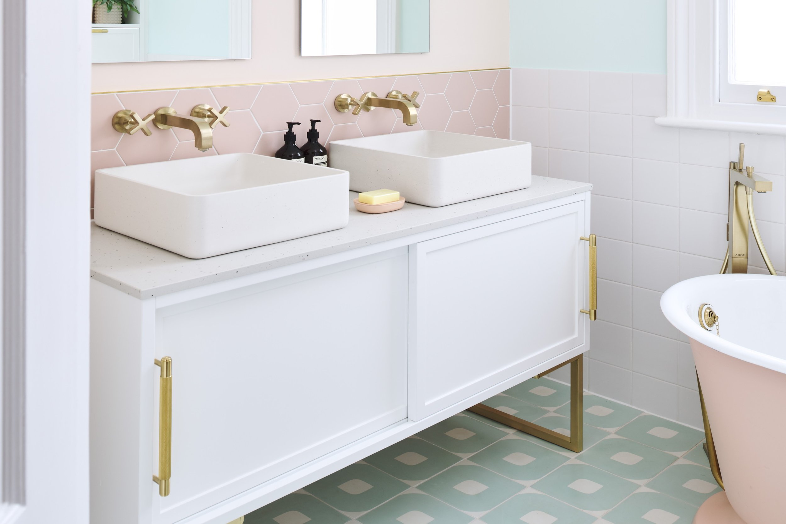
Due to the relatively small size of the room, Jo faced a challenging brief to include all the elements Geraldine dreamed of, without it looking overcrowded. Gerladine had always loved the idea of a rolltop slipper bath in her home but they usually come with a large footprint. To overcome this, Jo was able to source a compact version which was a great space-saver and matched the whimsy of the rest of the design. In a small space storage is always important and Jo bookended room with two clever solutions: a double vanity unit with deep sliding drawers on one side and in-built wall storage with room to house bathroom products and accessories on the other.
Beautiful basins
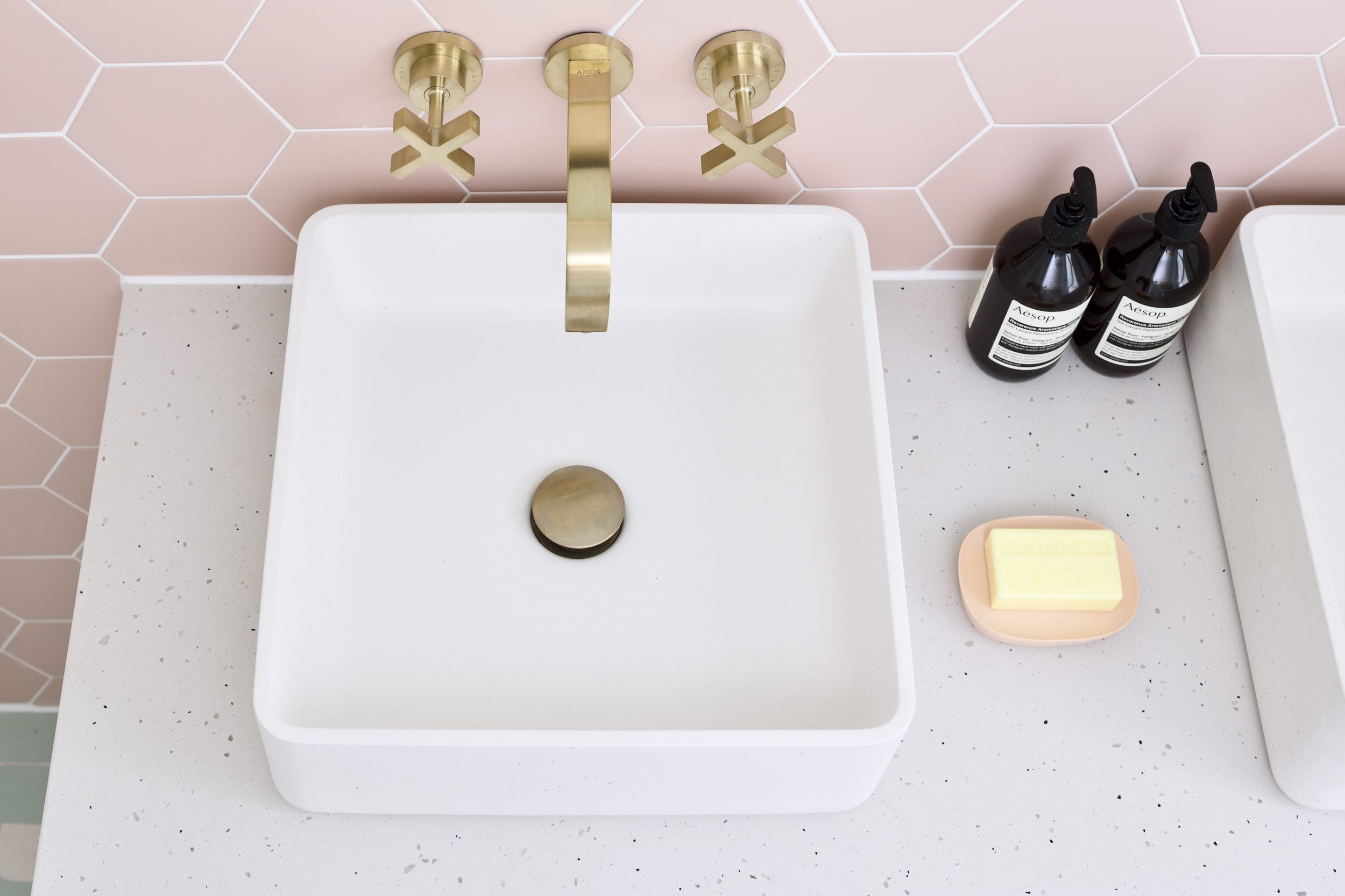
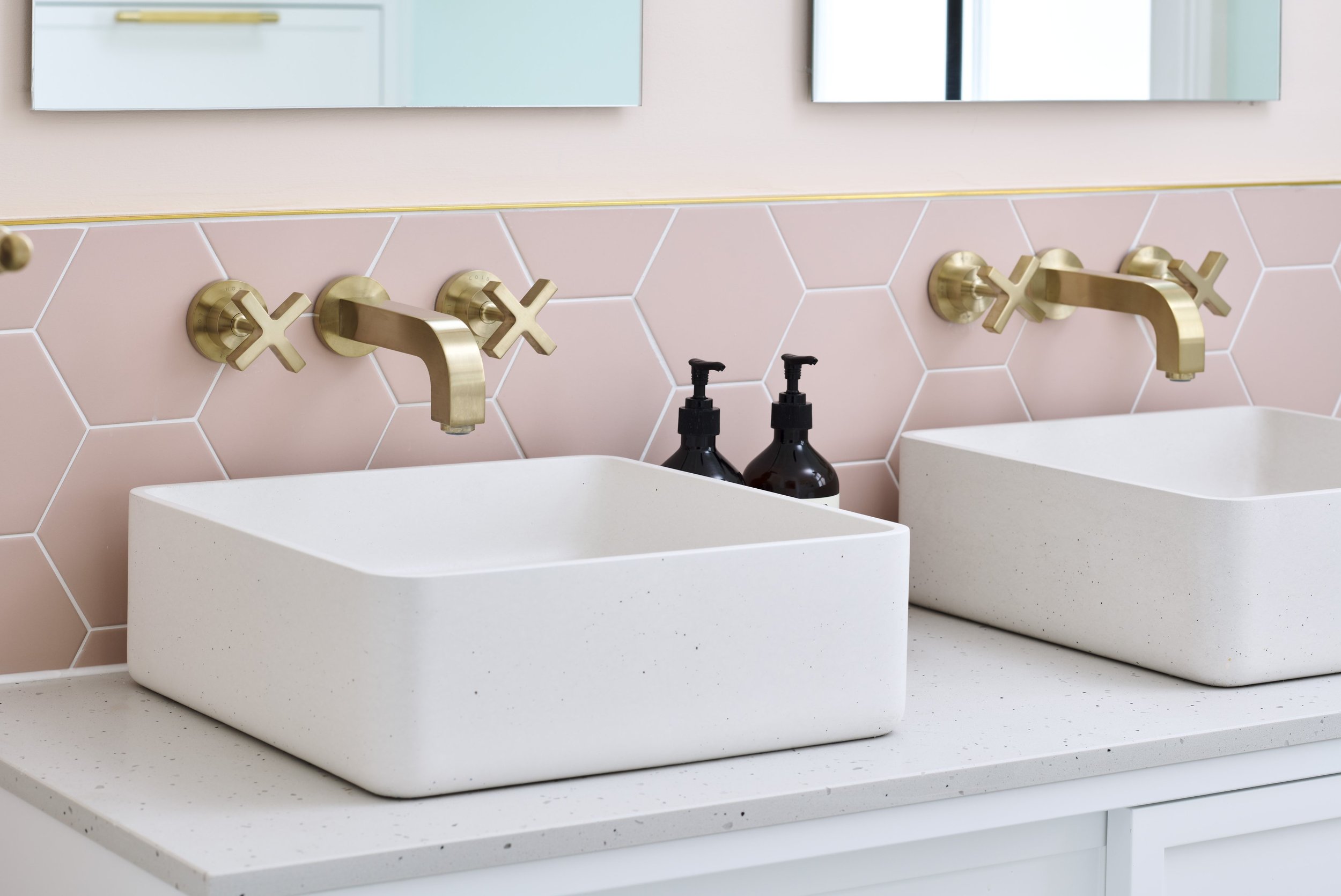
Also on Gerladine’s wishlist was a pair of matching concrete basins that she’d previously spotted on our Instagram page. Drawn in by the smooth contoured corners, organic texture and elegance, the basins made the perfect addition to Geraldine’s bathroom. Paired with a matching vanity countertop, the very Instagrammable basin area is an interior-lovers dream!
Sweetie toned tiles
In true Geraldine style, the colours in the bathroom were perhaps the most important element to get right. Gerladine chose a striking contrast of duck egg floor tiles and blush pink wall tiles, with white square tiles used in-between to ground the overall look. The exterior of the bath was suitably painted to match and whilst the white bath inner together the rest of the white elements.
“I wanted a bathroom that felt light, colourful and happy. It had to be aesthetically unique for me.”
- Geraldine Tan, Client
Finishing touches
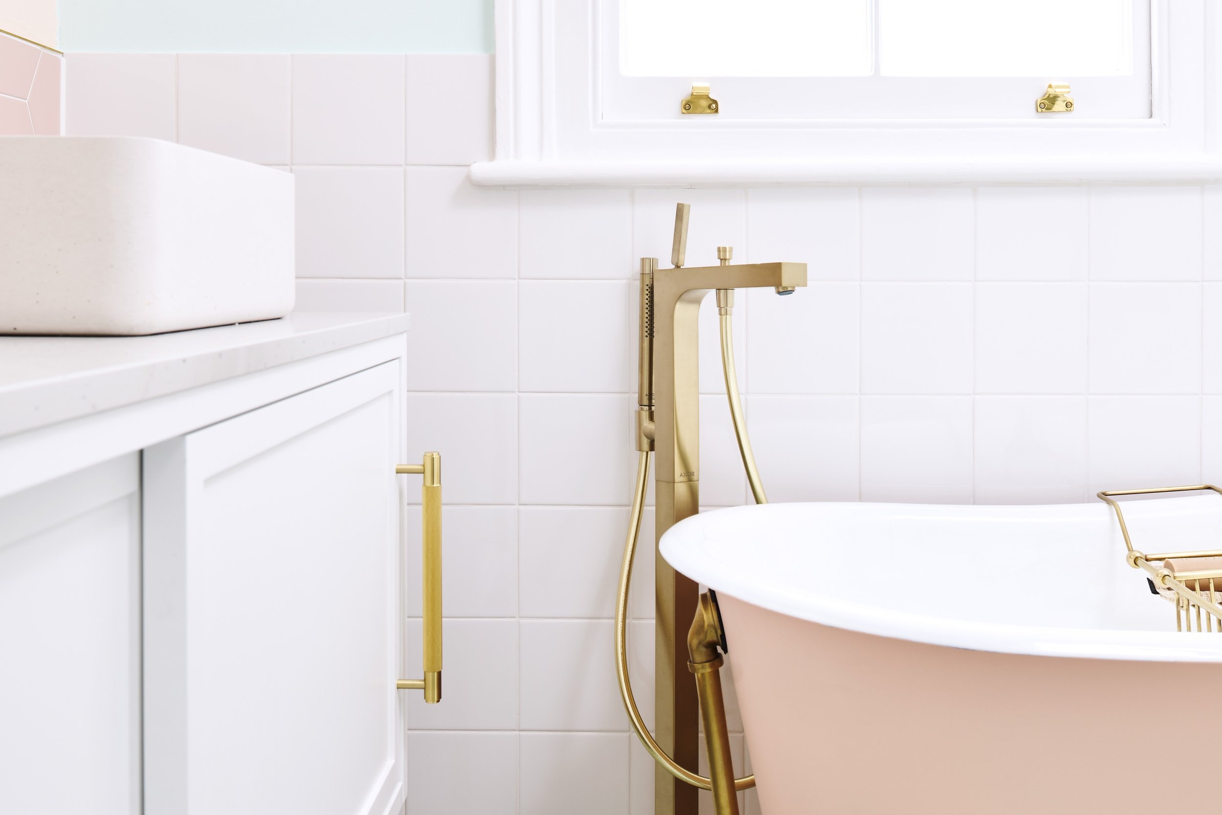
The existing bathroom had an abundance of stainless-steel fixtures and fittings but Geraldine has always been drawn to the warmth of brushed brass. Jo ensured every item of brassware meticulously matched, creating a cohesive scheme even down to the tiniest details of door handles and radiator valves.
The details
Location: North London
Designer: Jo, Ripples London
Products: Painted slipper bath, brushed brass crosshead basin mixer, eye pattern duck egg tiles, wall-hung radiator, wall-hung rimless WC
For advice, tips and tricks from our team of specialist bathroom designers, download or request a copy of our free Style Guide.
This bathroom was designed to best utilise its large footprint, incorporating a spacious walk-in shower, modern freestanding bath and plenty of storage.


