Case study: Elegant ensuite with bespoke furniture and a pop of plum
This spacious ensuite embraces traditional fixtures and fittings but with a colourful contemporary twist.
Leanne Robey, Senior Designer at Ripples Newbury, made the most of this spacious ensuite with an interesting layout and plenty of pops of colour.
The brief
The owners of this Edwardian home recently moved to the Wiltshire countryside after purchasing a second home to escape from the hustle and bustle of London. Built in 1912, the house is a fine example of Edwardian architecture and boasts several original features including a drawing room, cornicing and panelled walls. Quite a contrast from their contemporary living in the city, the homeowners sought help in modernising their en-suite but in a way that was sympathetic to the age and style of the property.
The layout
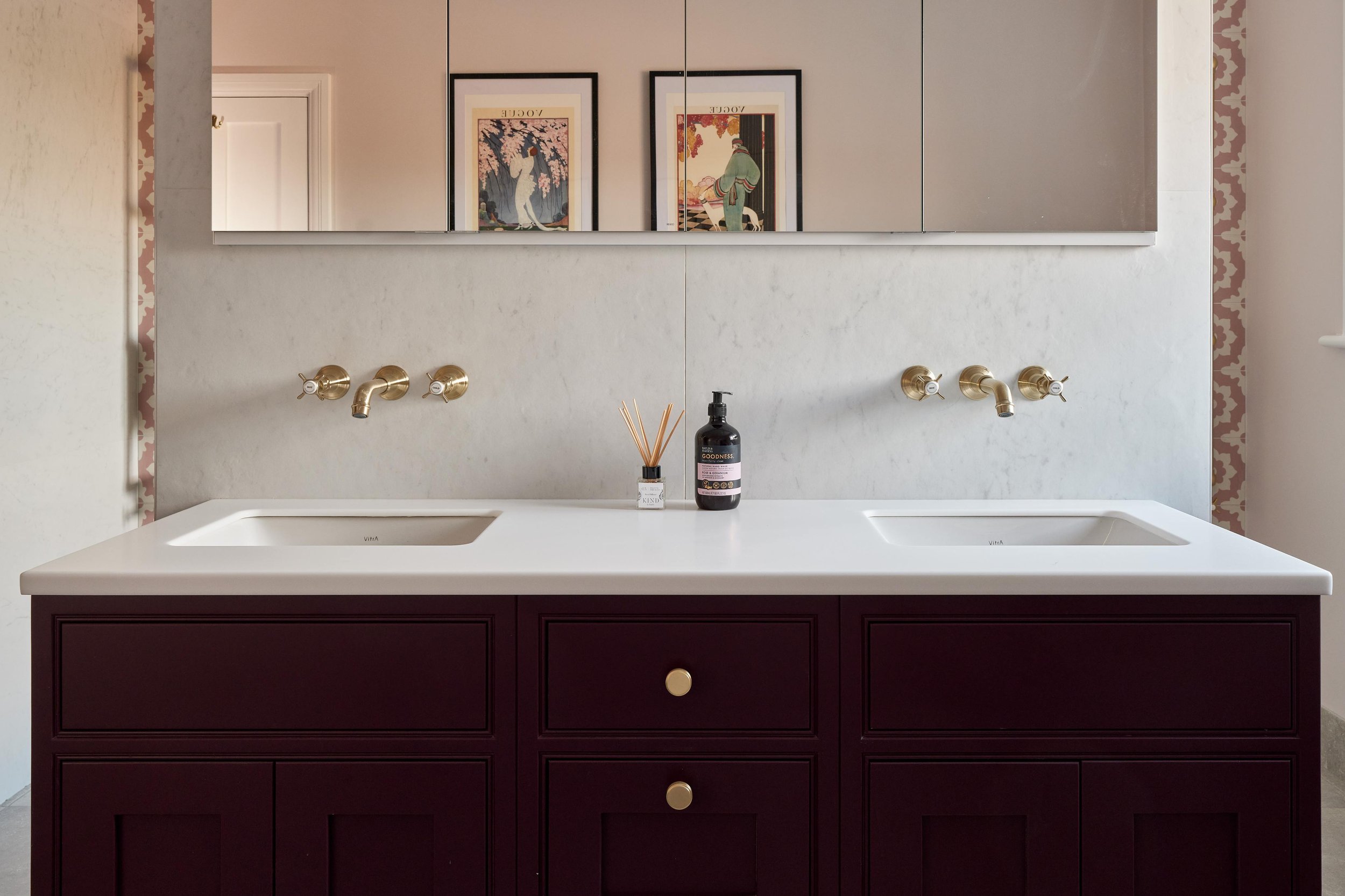
With multiple bathrooms within the property, the primary purpose of this space was as an ensuite to be used the winter months. With this in mind, Leanne wanted to make sure the space felt cosy and inviting, despite its generous size, and the layout she decided on helped achieve this. Perhaps the biggest design statement in the space is the partition wall in the centre of the room. This was incorporated to make the space feel less cavernous and to create distinct zones for the WC, vanity area and shower. The partition also helps create some privacy in the shower area, without making it feel too closed in. In addition, the wall provides space for a recessed mirror cabinet, creating a subtle storage solution. The large illuminated mirror bounces light from the ornate windows, creating a surprisingly light space even on dark winter days.
The vanity
With the wall decided upon, Leanne then explored options for furniture and opted for a beautiful bespoke vanity unit, custom painted in Farrow & Ball’s ‘Brinjal.’ This deep warming shade allowed the clients to embrace the cosy and cocooning feeling of winter and helps the space feel timeless. The vanity was finished with a stunning Corian top with in-built basins, as well as brushed brass crosshead taps which give a subtle nod to the property’s Edwardian heritage.
“This was such an interesting project to work on as I needed to make a large room feel cosy and also find the right balance of traditional and contemporary styles.”
-Leanne, Senior Designer
The shower
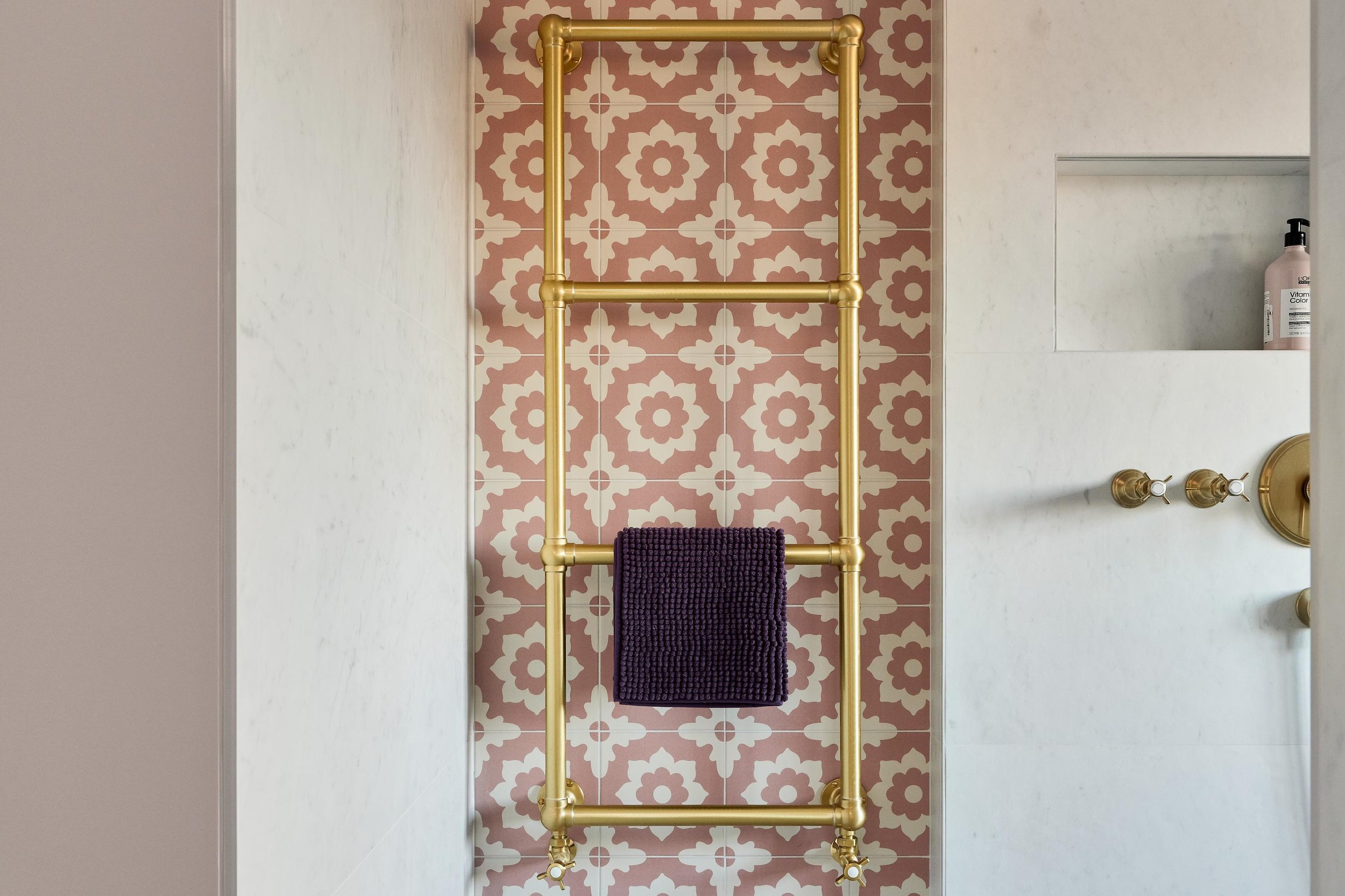
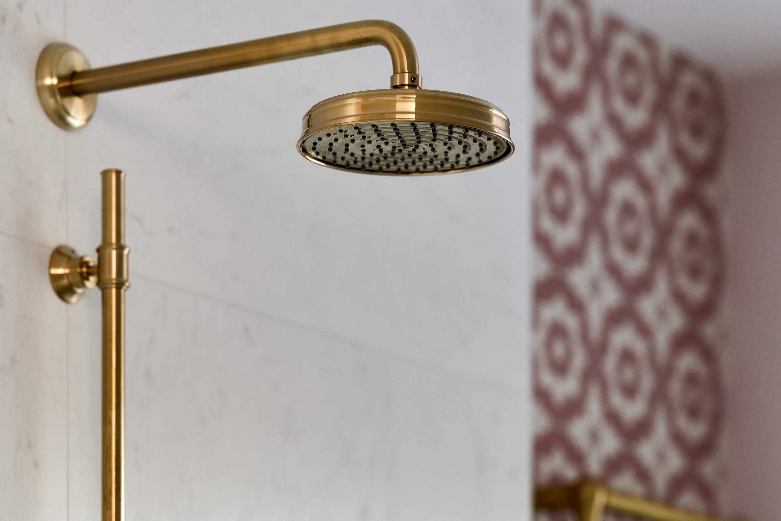
Leanne’s clients wanted to create a stand-out shower area and this was something she was really able to deliver on. With such a big space to play with, Leanne was able to design a large walk-in shower, reminiscent of a luxury hotel or spa. She mirrored the crosshead taps from the vanity area and matched them with a classic showerhead in brushed brass. Sleek storage was incorporated by building niches either side of the shower rail, removing clutter from the floor and making sure shower products are within easy reach. A traditional brushed brass towel rail was then positioned within the wall recesses either side of the shower, again adding to the spa feel but also generating a necessary heat source for the large room. A statement Edwardian-inspired tile finishes this area perfectly and its blush pink colour works beautifully with the plum palette.
Finishing touches
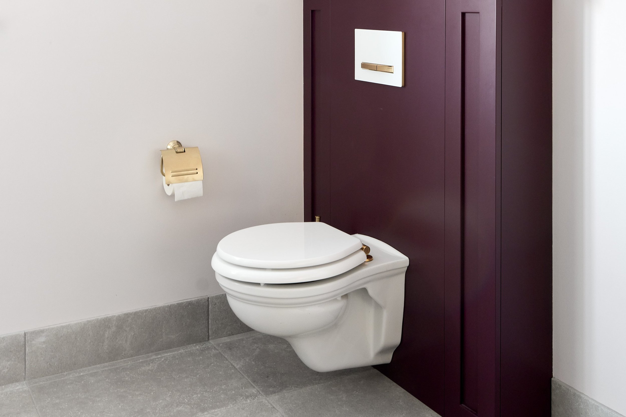
To match the vanity area, Leanne chose wooden panelling to sit behind the WC, offering a stylish way of concealing the piping and parts. To let the painted elements shine, the rest of the walls were kept quite neutral, which also helps brighten the space. Brushed brass brassware was then used across all details and finishing touches, right down to the WC screws and toilet roll holder.
The details
Location: Wiltshire
Designer: Leanne, Ripples Newbury
Price: From £32k (not including installation)
Products: Bespoke vanity unit with in-built basins, brushed brass brassware, illuminated mirror cabinet, floral tiles.


